If you have been a regular visitor, you will notice we have had a bit of a glow-up. As Head of Product, I am here to give you a bit of a rundown of the Byta redesign, why we did it and how we have freshened up.
When we launched an MVP to the public back in 2015 we were a tiny team of 3, building Byta out of our own pockets. We had a big idea, the skills to be able to turn that idea into a living product, and an app we were proud of. Fast forward 6 years. Our users have grown and so have we. Now a bigger team thanks to our seed round in 2020.
There had been many new features we were wanting to build, We needed to make improvements with speed, and also had plenty of user feedback that we were eager to work on. Unfortunately, the way the site was previously built meant that we weren’t able to deliver the improvements at the pace our ambition required. So I sat down with the whole team, from marketing through to developers, and we rebuilt the app from the ground up. Undertaking a redesign of something that is now so familiar can be a difficult and daunting task but we knew the reward for our users would be substantial, so we were eager to get going.
Byta Redesign: So what is different?
We had four main goals when it came to the redesign: user satisfaction, improved speed, flexibility for future development and ultimately a unified experience across our brand.
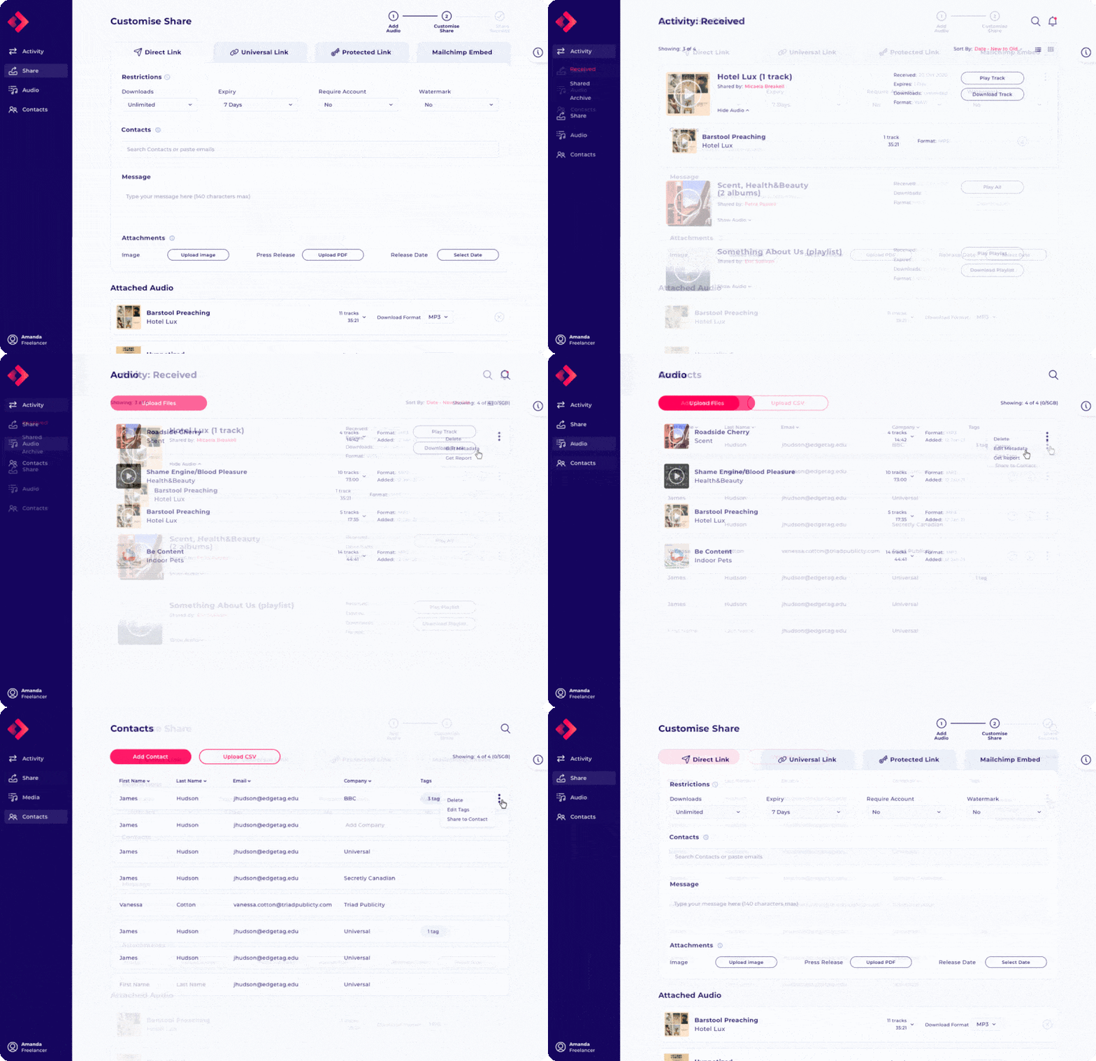
New cleaner look and feel
The new, cleaner layout makes the whole Byta experience even easier to navigate, saving time whenever you need to send and receive music.
The sharing and listening experience is always at the forefront for us. We want to ensure that as a recipient you can quickly stream and/or download the audio you have received. As a sender, you should know that your audio is being displayed (and played) in the best way possible. With this in mind, all of Byta’s features should now be easier to access, whatever plan you are on. Any information that you need to know about your audio is right at your fingertips.
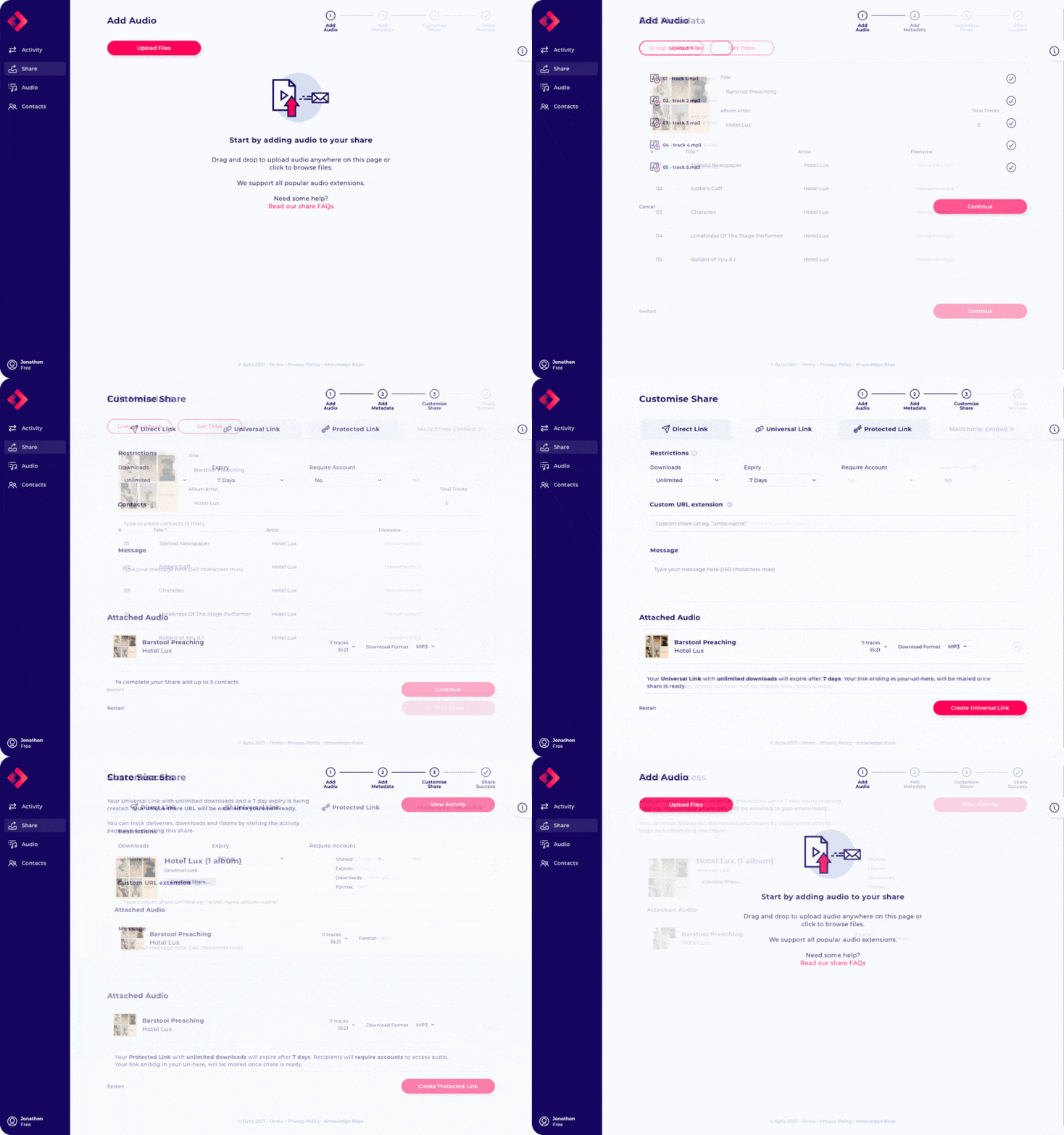
The Share page
You can find our biggest and best changes on the share page. We have now introduced a clearer step-by-step process: Add/upload audio is the first, as before you can easily add any combination of albums and tracks, with cleaner more organised search results for paid plans. Once you have collected your audio you can then move on to customise your share settings. We now allow you to easily toggle between our main share options: Direct Share, Universal Links, Private Links, Mailchimp (Freelancer +) and Forward (teams only); you will only see the fields required for that share type. Once you have filled out the relevant fields, review your audio and hit send. Simple!
Want to know more about sharing with Byta? Check out our features page for share breakdowns.

Distinct differences between shares and audio cards
Activity and public-facing Universal Links also had a refresh. Your audio files now sit combined into one “Share” that holds all the details attached to it. Expand the share card to find the individual albums and tracks, this makes your ‘Share” even clearer for both recipients and senders. Little changes like this mean that tasks such as deleting shares or downloading files are now easy to do. Saving you time.
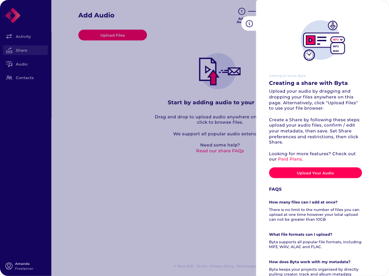
Easy to access help menus
We realised that help screens aren’t just necessary at the start of using a new app but should be accessible all the time, so from now on you can access information about a page and any FAQs at any point by clicking on the “i” icon at the top right of the screen. Do you still have questions? Drop us a message in the chat where someone is always around or have a look at our support centre.
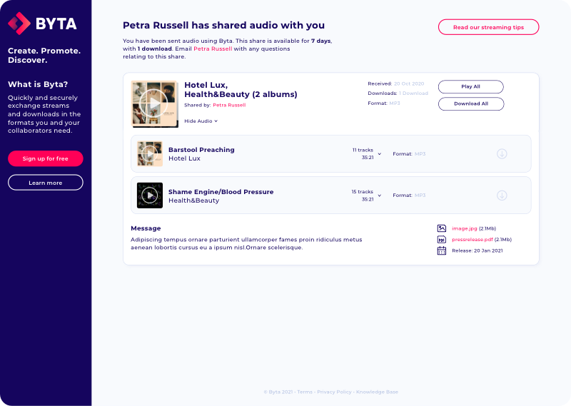
New improved Universal Link pages
Our public-facing links such as Universal Links and Direct Links now include a little more information about what Byta is so that your recipients will feel like they are in safe hands when receiving your Byta link. These pages also offer up a clearer display of what has been sent, replicating the in-app experience.
The most common feedback we received was that recipients of Universal links couldn’t access audio playback features like those in the app. So public-facing links now have access to the same audio player as users with an account.
Even the audio player itself has had a bit of a refresh, moving to the bottom of the page. Now there is more space so you can see what is going on, a larger time bar, playback times, artwork viewer and metadata display. Volume controllers are also now easier to use.
So, what is next?
While this was a great step forward in the new direction of a better Byta, it is still just the start of our plans. With these initial changes, you can now start looking forward to new features being rolled out over the coming months. Keep an eye out on our socials for more details of what is to come.
Jen
Head of Product
Give our redesign an upvote on Product Hunt

